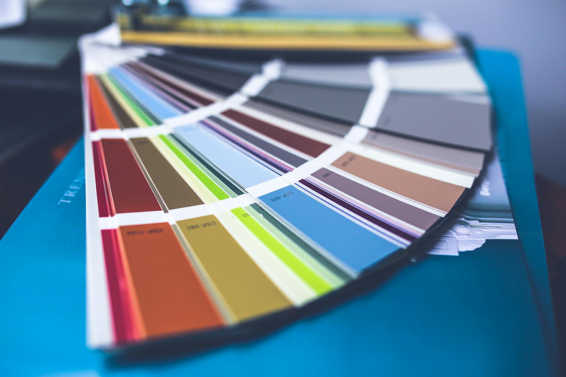
Learning Color Theory is essential for aesthetically appealing art that contains color. It connects to other concepts in art theory like value/lighting as well, so it is important.

Don’t worry, this article will still be updated and any new resources will not be locked down by a paywall
This image breaks down basic color schemes & color theory. Referencing this and/or committing this to memory will help you design color palettes and make decisions that look aesthetically pleasing.
First of all, a brief note on the some of the applications of color theory:
Color Theory Application – How to Apply Color Theory to Your Art
- Want more realistic drawings? Shade and highlight subjects with complimentary colors for richer and more accurate subjects. I.e, drawing a banana? get your purple out and shade with that. Make sure you don’t make the purple oversaturated though, otherwise it will look off. Blending/glazing with complimentary colors looks realistic, actually.
- Don’t go overboard with colors. One or two accents look good. There are many colors schemes to choose from, but don’t try to use all of them at once.
- I would recommend generating a ton of quick thumbnails with color schemes you think would work. You know what mood you want, so experiment, experiment, experiment
- Try to be aware of how nearby colored objects affect the color of other nearby colored objects. Texture/opacity of the object also plays into this. This is important bc light gets tinted as it bounces off surfaces. i.e., place a white ball near a red towel, and you will see some red on the white ball.
- You can break the rules if you want, don’t feel like your drawing has to fit color theory 100% of the time. We’re artists, we break rules once we know them!
Resources
If you can, go to the library and check out Color and Light: Guide for the Realist Painter by James Gurney. Link to SWAN Library :)
COLOR Primer - :Color + Value: by ziinyu
- “This is not a technique tutorial, it is a formal introduction to the principles of Color Theory, that can be applied across all visual media. The goal of this tutorial is to provide a reference source for discussion about color theory as well as value development.”
The talented cyrilrolando has serveral awesome tutorials! They are targetted towards digital painters, but color theory is applicable to many mediums!
Practical Color Theory by ajamoore
- How I See Color - A Tutorial by purplekecleon A really cool tutorial in a presentation format!
- thundercluck-blog’s Tutor Tuesday on Color Awesome demo & tutorial.
These sections of the detailed and amazing PSG Art Tutorial by Niklas Janssson. I suggest reading the whole thing, honestly.
- Color relativity
- Color identity
- Books about color theory
- Basic Color Theory - Color Matters
- How to Master Color Theory
- Understanding Color Theory
- https://www.jenreviews.com/color-meaning/ - written by a designer based on years of her industry experience
Color Scheme Designing Tools
Craft the perfect color palette with these tools.
Also consider trying a limited color palette or working the same piece with different combos. Experimentation will help you define your style.
- Color Palette Generator
- Made this tool to help you design and generate random color schemes if you have artist’s block.
- Adobe Color CC - my personal favorite, lots of options
- Coolors - curated color palettes
- ColorThief - extract colors from pictures
- Material Design Color Scheme
- Color Hunt
- Background Gradients - gradient color scheme design
Hopefully this helps you! If you have more questions about color or links to your favorite tutorials, feel free to share them with me!
Thanks for looking!


