
Learn how to create realistic art (and semi realistic art) with these excellent drawing tutorials, hand picked by me.
What is realism?
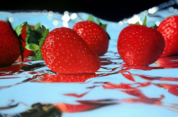
What is the basic definition of realistic art? Realistic art is pretty neat and aims to capture the subject how it appears in real life, that means accuracy and precision in lighting, color, structure and form, perspective, and proportions, and tons and tons of detail. If it’s done with technical skill, you can hardly tell that what you are looking at is not a photograph. I find that pretty cool.
Definitely keep in mind that realistic painting is only style of art art, and that you do not need draw with a realistic style if that’s not your thing!
Rules, once you know them, are kind of meant to be broken! The formation of your style is what is important! If you do want to learn to draw like this, try not to get frustrated. It’s a bit hard to match details exactly, honestly.
Knowing the principles behind realistic art will help you draw what’s in your imagination. It’s easier to draw things when you have a solid grasp on why things look the way they do in reality. Many semi realistic styles, and I would include even some manga under that category, are based heavily in reality, but stylized.
Also, while talking about style, this is an interesting read: Realism, photorealism, and style in drawing.
Realistic art examples


These are just a few of the many inspiring, fantastic realistic painters out there.
How to create realistic art
Since there are tons of things that go into creating a piece of realstic art, mastering realism will take lots of time, dedication, and patience.
Before you try your newest hyper realism attempt, you may want to consider your understanding of the fundamentals.
Anatomy and construction
If you want to render a realistic looking cat, or a fruit that looks real enough to eat, you have to understand how that furry critter is constructed – how those muscles, fur, bones, and hair all integrate to form an adorable cat that will meow at you at 5am – or how that fruit is actually composed of layers of pigments and layers of cells.
Consider checking out my resources on human anatomy.
Proportion & Form
Often goes in hand with anatomy. Make sure that your proportions are correct. This requires tracking measurements in someway. Some people like to use a grid, while I like to look at the negative space and see if the lengths look correct. It’s easier to learn body proportions if you go by relative measurements. With enough practice, you will be able to quickly have a “feel” for it, similar to how you can “hear” if a grammatical structure is wrong.
A large part of realistic drawing is you remembering to keep looking back at what you drawing, your reference.
Perspective
This is also really important! You need to make sure you are drawing what you see, not what you think you see. Foreshortening is the product of things looking visually overlapped due to spatial positioning.
If you want to learn more about perspective, check out this guide on how to keep things in perspective.
Color
Does not apply to monochrome or black and white realism pieces. Note that this integrates closely with value and lighting. Shadows are actually not black and highlights are not white.
Visible color happens because visible light is an electromagnatic wave, and we see stuff as different colors because some pigments absorb some wavelengths. We see the ones that bounce back at us as the color.
This physical property also helps us understand why shadows and highlights are tinted with color–light bounces around.
I wrote about color theory resources and encourage you to check them out!
Lighting & Value
Extremely important. We interpret objects as a result of our retinas seeing light reflected back at different intensities. As an artist looking to draw or paint realistic objects, you have to consider multiple sources of light, bouncing light, different harshness and intensities of light, softness / hardness, how light appears different at different distances, how light curves around the object, the manner in which light falls away from an object, creating shadows.
In connection to above, remember that edges matter. You should not outline things randomly in black or darker shades (for realistic paintings) because this does not happen in the natural world.
Changes in value create edges. Also, make sure you know when to blend, and when not to blend. Do not overblend everything, as some things need to stay sharp.
Sometimes squinting can help you see tone better. There are a lot and lot of nuances to account for. Make sure for whatever medium you use, you are pressing gently enough that you can gradually build value. It’s easier to do this instead of trying to erase. If you are working digital, your life will be easier in this regard!
Recommended Reading – Curated tutorials, youtube videos, and more for creating realistic art
- If there is one resource you need to check out, it’s proko!
- Linked in my beginner’s guide to digital art, but has a pretty realistic style so it’s relevant: ctrl +paint
- This solid video series Do’s and Don’ts Tutorials
- Mark Crilley’s Videos
- Drawing on the Right Side of the Brain: The Definitive, 4th edition - helps you detach your mind and draw what you see
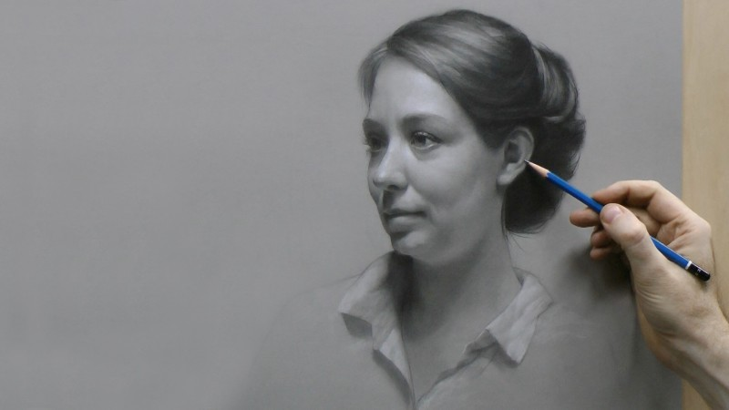
- Pencil Portraits: How to draw realistically
- Realistic Observational Drawings - Student Art Guide
- This very helpful question and answer thread on Quora
- Books by James Gurney. I recommend both Color and Light and Imaginative Realism.
- A really good, step by step drawing tutorial by Carlos Aleman
- A specific, step by step video tutorial on how to draw a realistic face.
Have any awesome realistic drawings of your own? Feel free to share in the comments below! :D
Thank you for reading! If you enjoyed this article, please consider sharing it with your friends! :D